Final Three Web Page Designs
From my previous post on the basic web design for all my pages it is clear that my three pages are a home page, an about page, and a gallery page. Some of the designs have changed from the initial designs, which is progress. So here they are...
The Home Page
I have decided to create the home page in the style of an up to date professional blog. After looking at one blog post in more detail, (by clicking continue reading,) there will be links to further blog posts related to the one the viewer just read. I have decided to put the three most up to date blog posts in sections of the three types of photography, which my company focuses on, studio and location photography, and the editing processes I go through. As well as these blog posts I have added a banner towards the bottom of the page advertising my products during the festive season, with the hope that people who like my work will purchase some of my photographs for themselves or other people for christmas. I have presented details where people can make enquiries on my home page also, because my company specialises in creating the image you want to see as well as in my own point of view.
The About Page

My about page is very simple yet informative. It explains the journey I have been through from my hobby of photography through education to setting up the company. I have placed some quick important information before writing about the company and I, because due to high demand and no patience in the modern world people need answers to their questions quickly, so I placed the most commonly asked questions' answers first in a biographical format. Then I have spoke about the company and I in further detail explaining my journey and informing the viewer about myself. At first I faced the challenge of knowing what information to put on the internet about myself without giving away too many details. i have overcome this by stating general information like the city I live in and not my address, and I decided that my date of birth may be important, however, on a Facebook account that information will be evident anyway. Also, I was thinking about every year having a special deal on my photographic works on my birthday, so this information is able to be displayed.
The Gallery Page
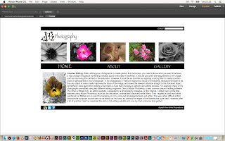
The gallery page is the final web design out of my three pages. My initial design showed several albums of my work on my website. However, I have decided that a simpler layout was needed, because the page became to full that the viewer didn't know where to look. I have decided to have my gallery page as links into albums containing all my photographs taken at different times in these three sections, which are studio photographs, location photographs and edited photographs. I have chosen two photographs to represent each section to give more of a varied selection in the attempt to have the viewer know where they're going and what they are able to find. The Myriad Pro regular font is used on each section for clarity and legibility. I have used two simple roses from my logo design to fill them empty space on the page, for recognisability and to fill the blank spaces, like my photography does.
Just to clarify...
My Company
My company name is Shauna Richards Photography. My logo design is my initials with black and red roses on them and the word photography in an indented font to act like thorns from a rose. I have created a recognisable brand identity of detailed, dainty photographs of flowers, and my company ethos is to present my photography in my point of view and to construct personalised photographs to represent what other people would like to see.
My Web Design Features
I have included a home page in the style of a blog. I have a banner in the form of advertisements. After experimenting with buttons I found that a navigation bar would work better as it was simple and easy to use for the viewer. I have posted a variety of content on my web designs such as, a blog of my up to date work, some information on myself (the photographer) and the company, and a full archive of all my best pieces of work in the layout of a gallery. The colour scheme for my website follows the colour scheme of my logo, which is black, white and red. However in some circumstances pink is used instead of red, for example the five images which represent my company are black, white and pink, to create a prettier atmosphere. I have used several graphics e.g. links to other work, social network icon to take viewers straight to my social network pages, and a search bar. Many fonts such as Papyrus regular, Myriad Pro regular and Pristina regular have been applied to my we page designs.


