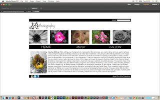
Throughout the creative making process of this assignment, I tweaked a couple of features from my designs. These small changes are very evident on my final outcome, and create a more professional appearance and organised structure.
Here you can see my full design (above). You can see the master file basically contains the features which stay on every page, for example, the header, footer and navigation bar. Each file looks neat and organised apart from the three galleries, because in order to see the photographs full screen after clicking the thumbnails they have to over-ride the neatness of the design and fill the screen.
Some advice I got given during the creative process was to add more colour to my design, because it looked boring and plain. So, I decided to add a slanted rectangle to remove some of the structure and add some creative artistic elements on the website not just the photographs. The colour of the rectangle is actually the lightest colour on the image with the location photography blog post. Also, by adding a working form people who want to purchase my book can just fill out the form and send off for one.

These three pages (above) show my literacy skills and teaching skills. This will be an ongoing blog updated every week with a new lesson on each three themes. This shows I am more than just a blogger or just a photographer. I am a teacher. I am providing more materials for young aspirational photographers who would visit my website every week to learn something new.
From my original design this about page has changed a lot. There is less writing and the images are a lot bigger. They fill the space. They fill the page.
My gallery design is basically the same. It is very simple yet does its job. Its clear and easy to work.
These are the galleries when you click on one of the yellow flower images on the main gallery page. When you click on the thumbnail of a picture then it appears full screen in a slide show format.
If I could change anything on my designs I would create social media pages also to link up to this website using the social media thumbnails in the bottom left corner.


